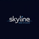
Why We Changed Our Logo
Our previous logo, with a detailed city skyline, represented the foundation of our work—building strong digital infrastructure. But as we grew, we needed a visual identity that matched our evolution into a modern, innovative, and dynamic web studio.
Our new logo reflects our future-focused mission: to empower businesses with powerful, scalable web solutions .
What the New Logo Means
Every element of the new logo was carefully designed:
- Arrow in the “l”: Growth, progress, and upward momentum.
- Modern, rounded font: Clarity and friendliness in design.
- Open doorway in the “n”: Entry to digital transformation.
- Dark theme + blue accents: Trust, professionalism, and digital depth.
This logo is more than a rebrand—it’s a promise to keep growing and helping our clients grow with us.
What’s Next for Skyline Web Studio
As we embrace this fresh identity, here’s what’s coming:
✅ Full-stack Website Development
✅ Custom Odoo Modules for eCommerce & CRM
✅ Faster, more collaborative project delivery
✅ Branding and UI/UX upgrades for our clients
✅ Smarter automation solutions
✅ custom app development
We’re not just building websites—we’re building digital ecosystems.
The Future Is Bright
This logo rebrand isn’t just a facelift—it’s our new direction. A modern, bold, and scalable web studio, ready for what’s next.
👋 Want to work with a forward-thinking Odoo web team?
📩 Contact us now or visit our Services page.
Let’s grow together. 🚀
OLD logo
![]()
NEW logo
![]()